Brand Identity Concept: N.H. Fisher Cats
Creating a refreshed look that better connects the brand to the natural beauty of New Hampshire through a modernized color palette, new logos and uniforms, and revitalized merchandising opportunities.
The Vision
The New Hampshire Fisher Cats are a Double-A minor league baseball team and affiliate of the Toronto Blue Jays. The team's current logos have been in use since 2008, with the last major update being a change to the primary colors in 2011. In the ever-evolving landscape of minor league baseball branding, I wanted to make a concept of a complete brand overhaul, to include colors, logos, jerseys, hats, and merchandise to refresh the team's look and foster a sense of state pride through the design.
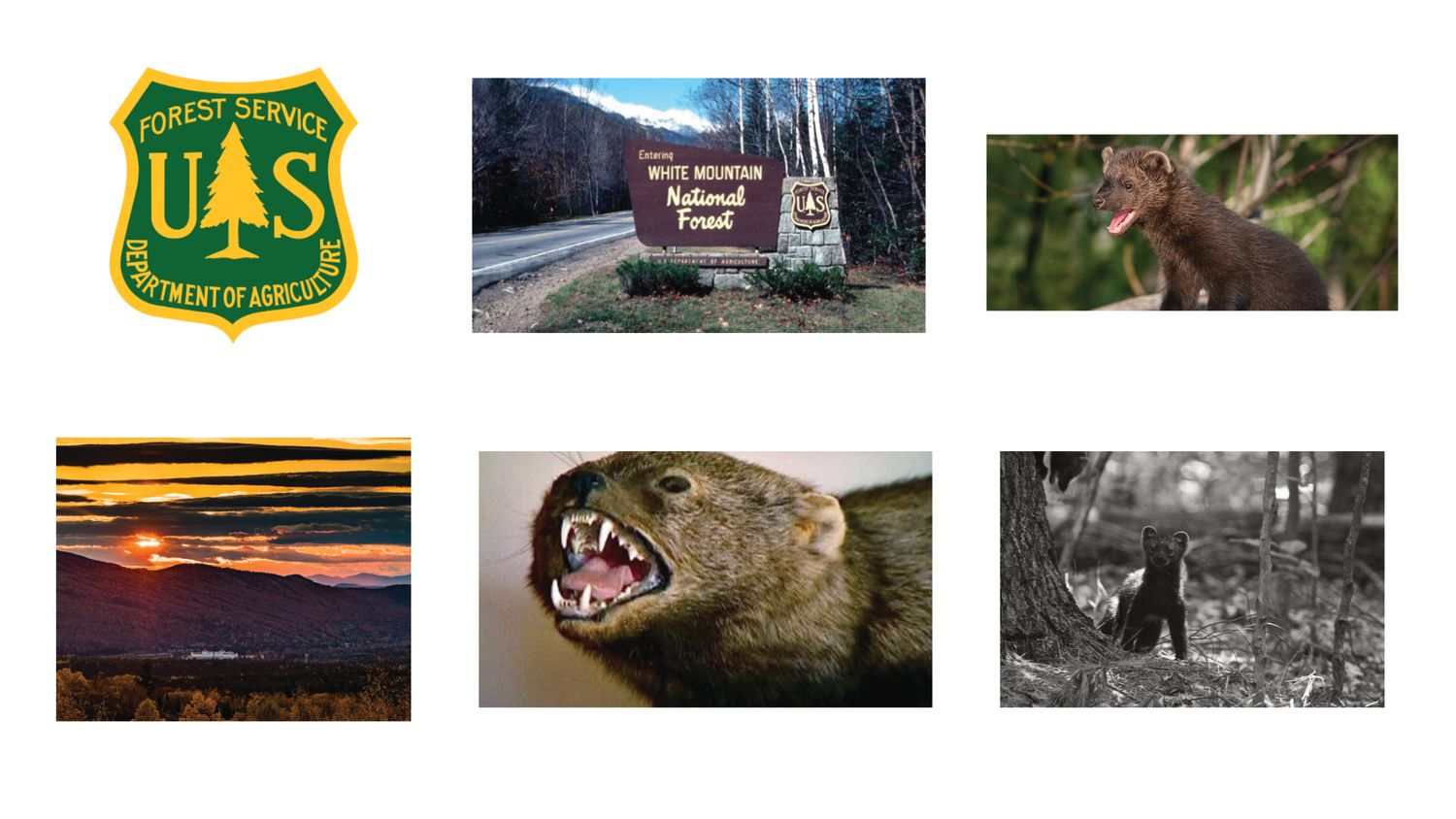
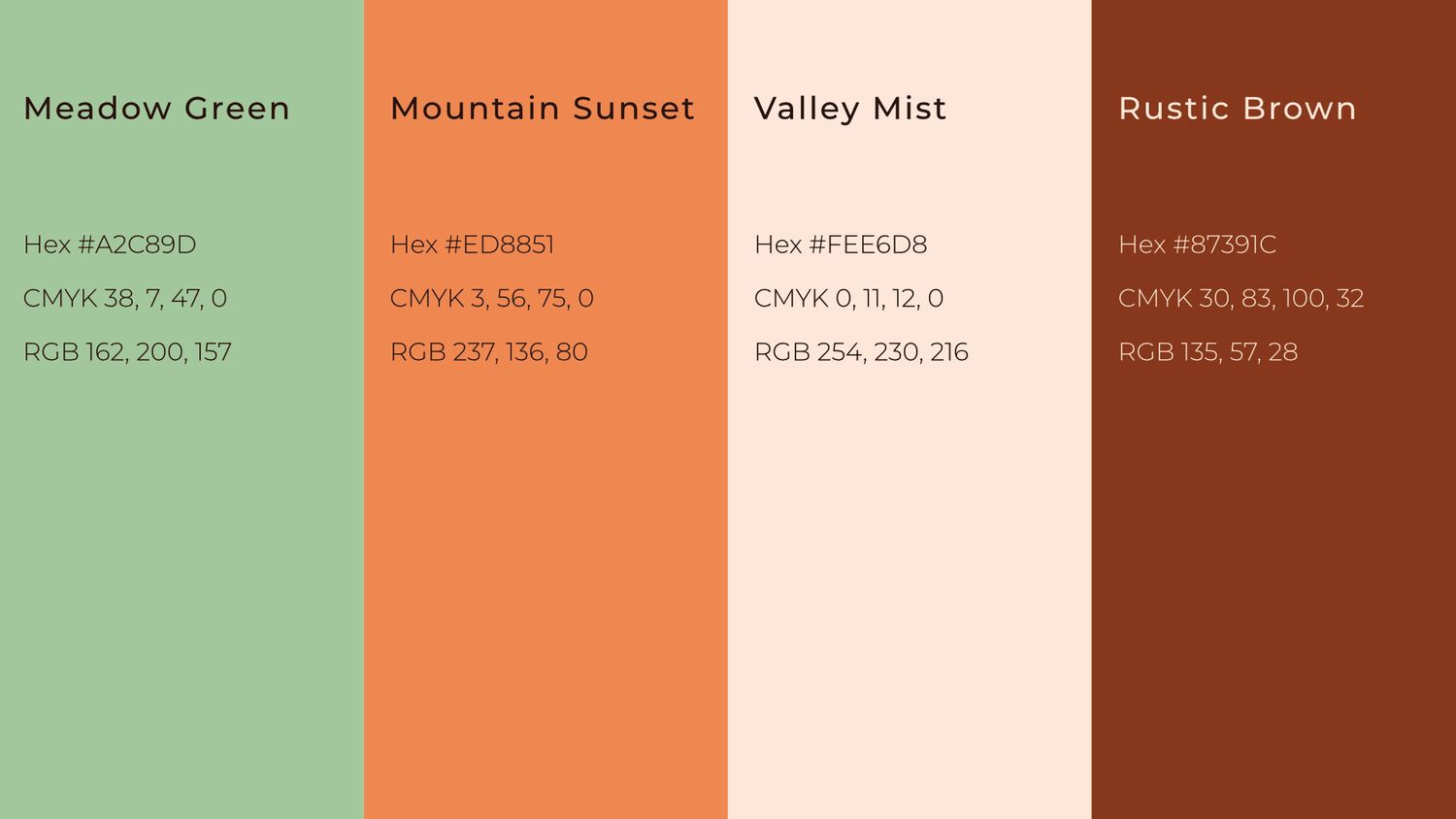
The main goal for the design was to use the branding and color palette as a means of connecting more with picturesque nature of New Hampshire, particularly through the use of the state's iconic White Mountains and Mt. Washington as points of inspiration. To achieve this, I referenced the well-known imagery and signage of White Mountain National Forest and the broader National Park and Forests System symbology, in addition to photos of the New Hampshire's mountain ranges, and of course, the team's mammalian namesake, the Fisher.
Through this initial exploration and mood boarding, my goal became focused on the following: rebrand the team with an eye-catching, nature-inspired color palette, combined with wordmarks and logos that evoke a rustic, warm, nostalgic sense that one may encounter when exploring New Hampshire and its natural beauty.
Core Identity
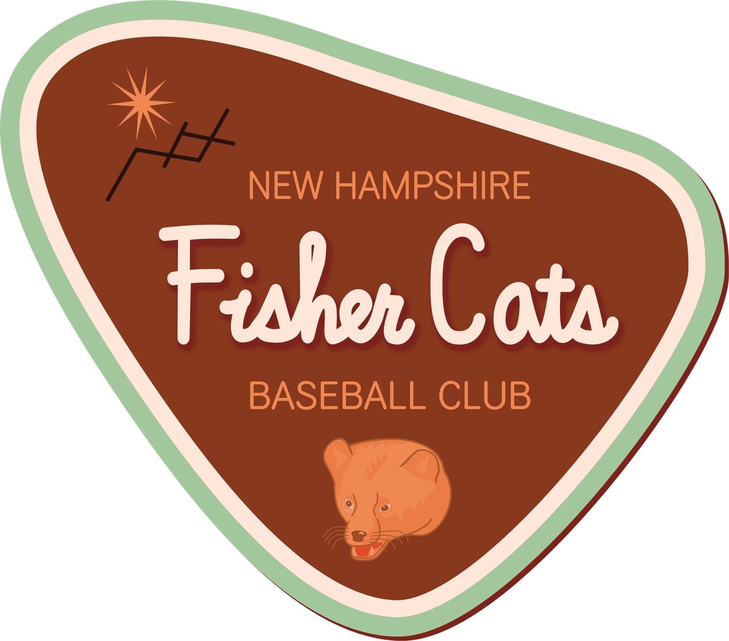
Primary
Secondary / Cap

Home Wordmark
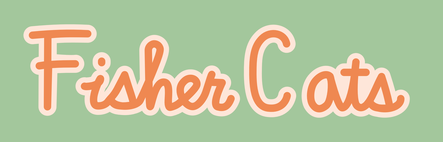
Road Wordmark

Supporting Marks
Third / Sleeve Mark

Lettermark

Alternate

The sun and mountain motifs are used throughout the design. The 10 pointed sun is a nod to the 10 counties of New Hampshire, and the state's initials form the slopes of the mountain.
Color Palette
On-Field
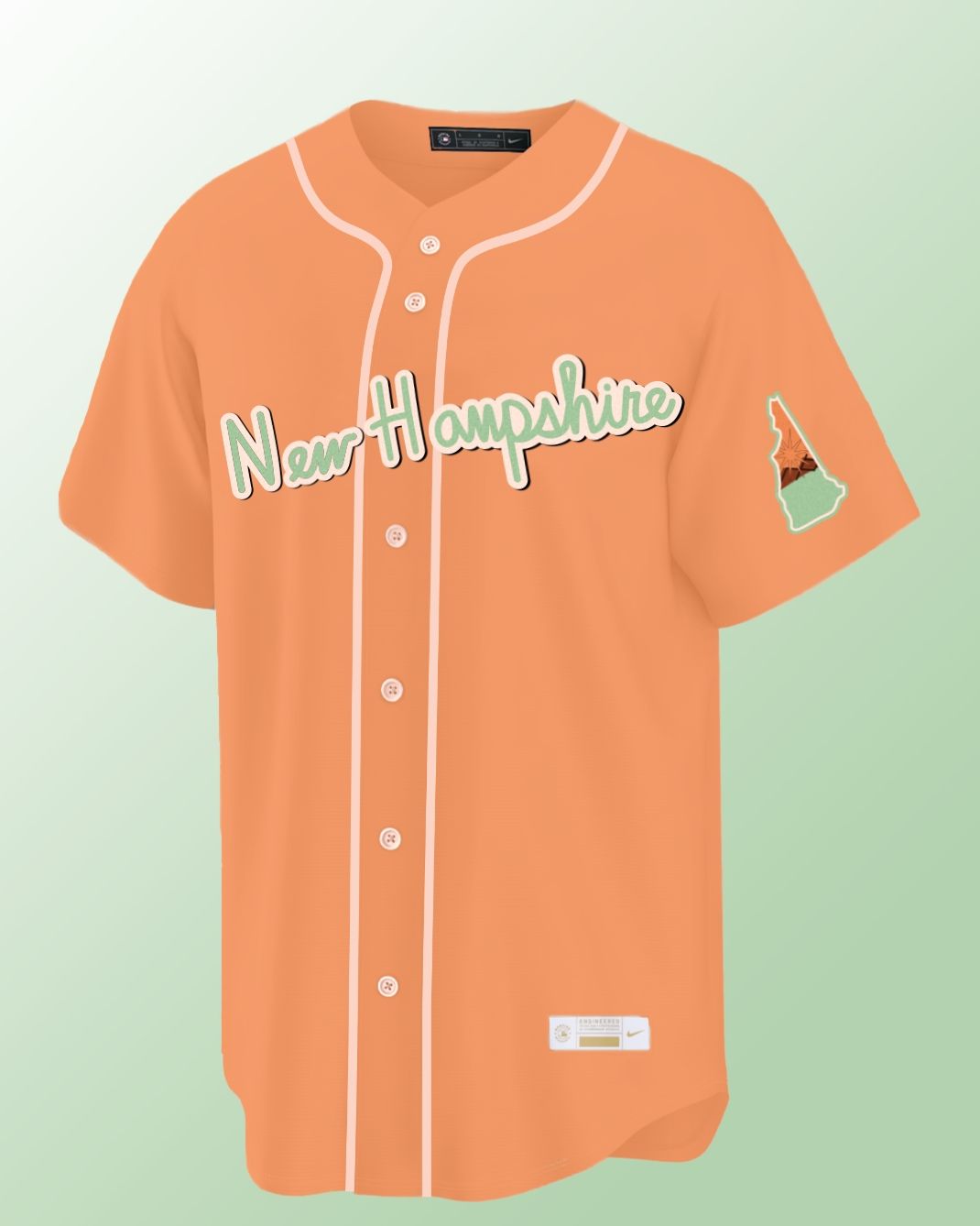
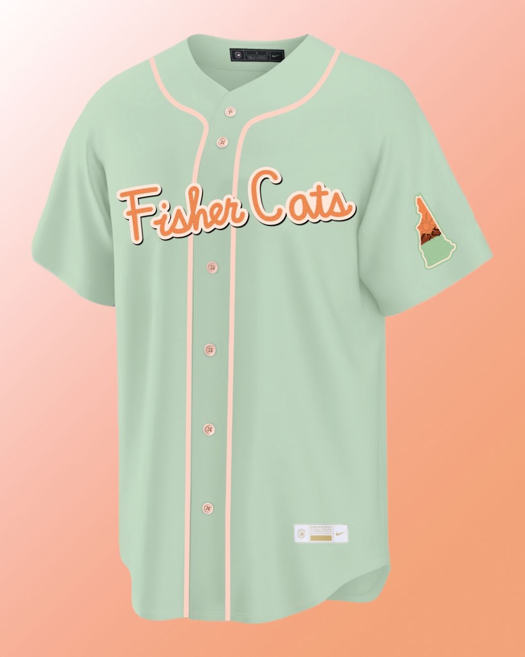
Home Uniform Mockup
Away Uniform Mockup
Final Thoughts
This rebrand concept aims to bring the Fisher Cats' identity into a new era in a minor league baseball branding scene that is consistently changing in favor of bold, eye-catching colors and designs. At its core, the concept seeks to make the Fisher Cats a unifying source of state pride by keeping New Hampshire at the forefront of all design choices.
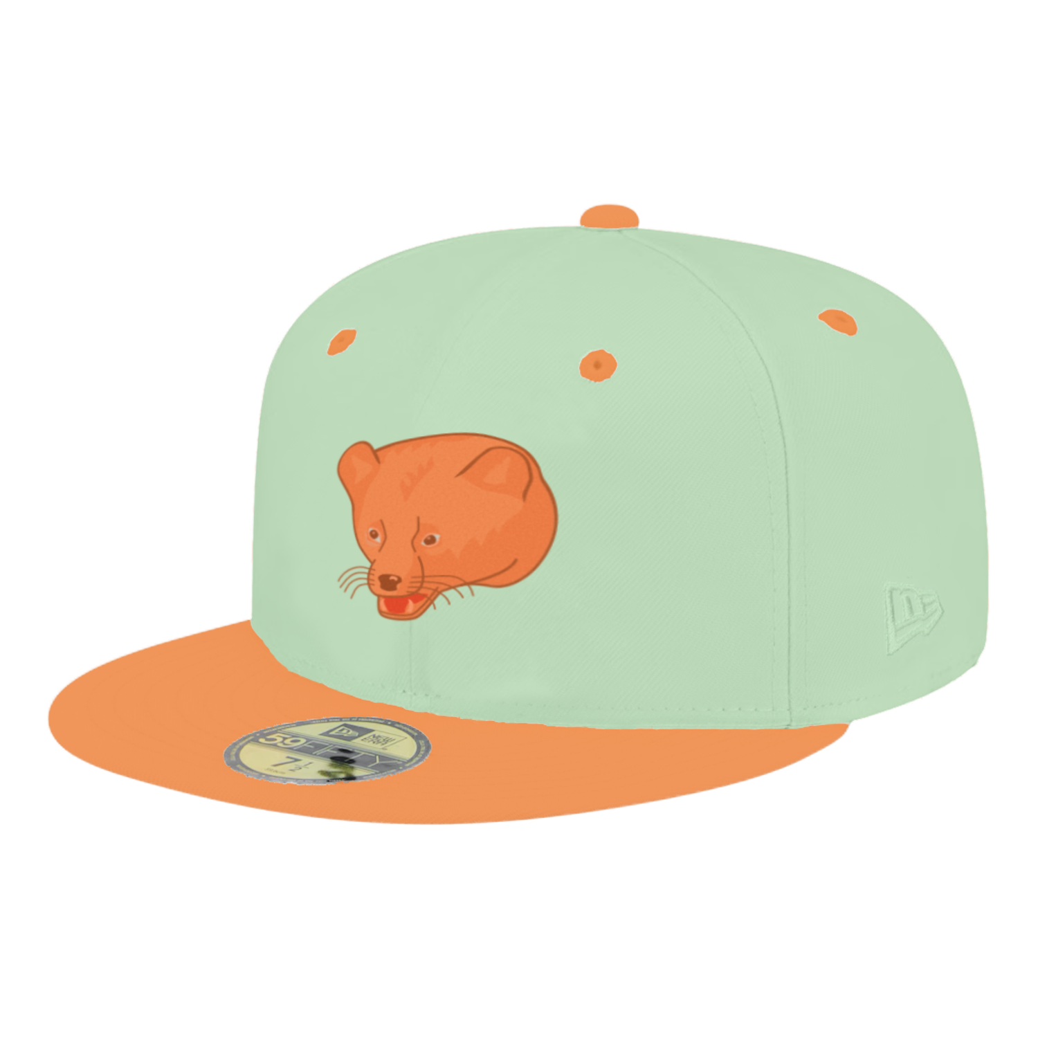
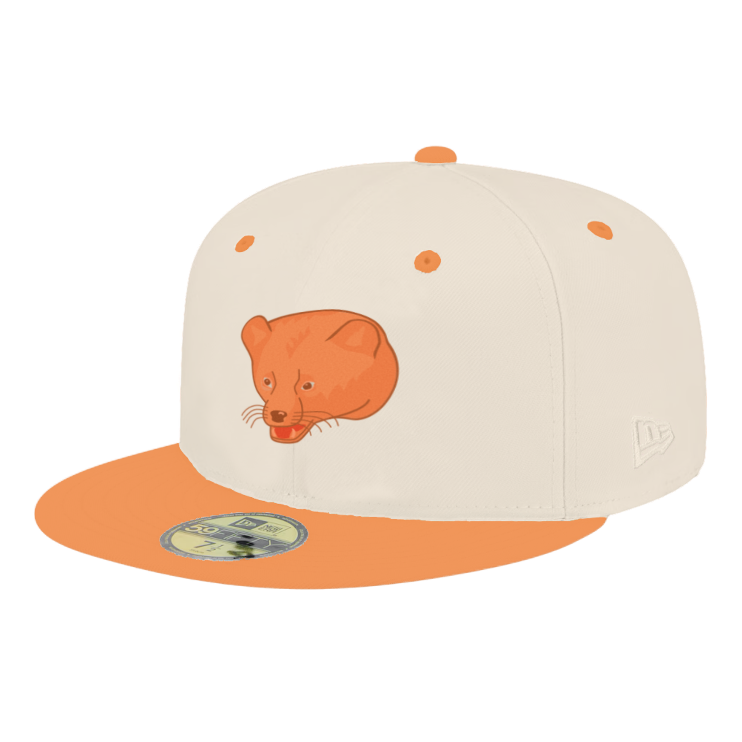
Additionally, the rebrand works as a cohesive system, intended to provide consistent motifs and reference points for merchandising opportunities. The result is a New Hampshire-first identity that includes vintage, nature-inspired design cues, while positioning the brand for a modern future.
Thanks for stopping by!
Stay tuned for more design and creative endeavors.